Inventory in Soracca
I've received a few questions on how inventory is handled in TMoS, so I figured I would make a devlog covering the subject.
To front-load some information:
- TMoS was made in Game Maker Studio 2
- TMoS was made with the intention of having no pause functionality
- TMoS was made to somewhat resemble old computer games
- I have some of my GML color-coding modified
These design decisions were made not only for design and style purposes, but because I was too inexperienced with GMS2 to feel comfortable diving deep into menu design or pause functionalities. So, if you're also scared about touching those kinds of systems, this style of inventory may work out for you.
So, how does it work? The inventory display is managed by a GUI object simply called "obj_gui". Its Step event contains this:
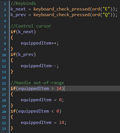
That's it. There are 14 item slots in the inventory. Pressing Q or E cycles the equipped item. "equippedItem" is referenced by "obj_player" when the use key is pressed. The rest of the display is handled within the Draw GUI event.
Blank cells are drawn using a for loop, and a switch statement is used to handle which cell gets highlighted based on the "equippedItem" variable.
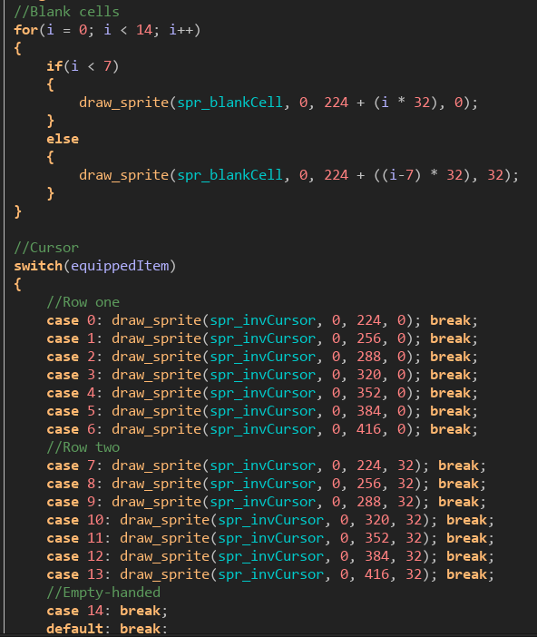
Simple stuff. Though, in hindsight, I shouldn't have hard-coded these position variables. If I ever wanted to shift all of these elements, I would have to go back and do so manually by editing each line. If I had made these variables, I could just modify a single variable and each element would be adjusted accordingly.
Next, I display the small icons in each cell based on whether or not the player has that item in their inventory. These are simple if statements made cleaner by how GML handles if statements.
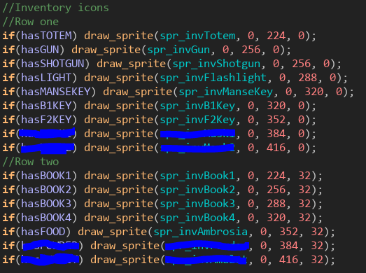
Again, hardcoding is bad practice. The "has___" variables are set up in the Create event by reading a DS map. The GUI is a persistent object, so it only needs to run that load sequence once, which is nice.
Next comes the messiest segment of this whole thing: displaying which object the player is currently holding. The system needs to handle a couple scenarios:
- The player is holding a tool with additional resource information
- The player is holding a key item (no extra resources)
- The player has a slot selected where more than one item sits
- The player is hovering over a slot for an item they do not posses, and thus cannot use it
- The player is empty-handed as a result of cycling out of the inventory or pressing H
To demonstrate how this works, we'll look at a simple item, then a more complex item.
This is what the code for holding a book looks like:
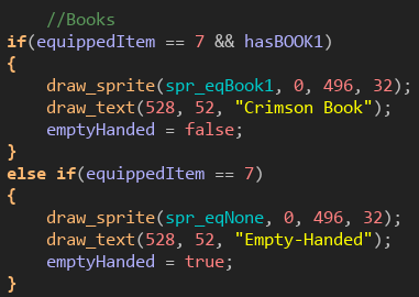
If "equippedItem" equals 7, then they are on the slot for the Crimson Book. If, then, they also have that book, it will display the item and draw its name. It will also set the "emptyHanded" variable to false (this is relevant for events that require both hands). Otherwise, if they have this slot selected, but they haven't found the book, we display the sprite for empty handed, draw that text, and set the empty handed variable to true.
Pretty simple right? Let's look at something a little more complex. Here is the code for how the guns are handled.
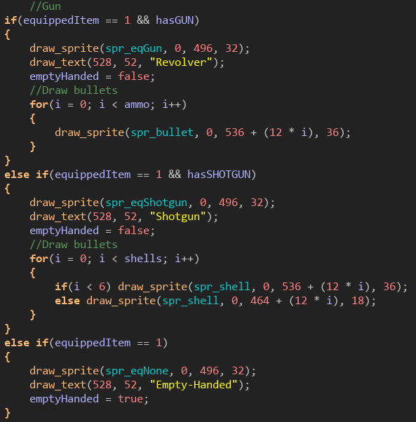
In TMoS, you can only carry one weapon. You either have the Revolver, the Shotgun, or neither. It really doesn't matter which order the two guns are in, but I added the shotgun later, so it's below (which also explains why revolver is just referred to as "gun" instead of "handgun" or "revolver"). Other than the nested items, we also need to display the ammo. Like with the cells, we use a for loop to draw these rather than a huge if or switch statement. The shotgun is a little more complicated since its max ammo capacity is 12 rather than 6.
Those two examples cover all the scenarios that we listed above, with the exception of the last one. That's a simple case.
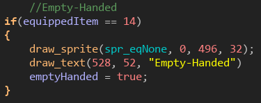
And we're done! When it's all put together, it looks like this!

So, what are the advantages of displaying an inventory like this?
- You know exactly what you have at a glance. No need to open a separate menu screen.
- Interaction is diegetic. Cycling through the inventory feels like rummaging through a bag.
- Gives a clear indication of your progression through the game. A full inventory = progress.
- Compact, neat, and clean.
Of course, it comes with its drawbacks
- Conservative use of screen space makes it not ideal for games with large inventories.
- Not very flexible to design changes later in development.
- Cycling item by item can be clunky and slow (though TMoS does have hotkeys).
- Kind of small, may be difficult for some to read.
I hope that helps anyone starting out with GMS2 who is looking to do a simple inventory system. If you have any other topics you would like me to cover in regards to how I've made games, please let me know!
Get The Manse on Soracca
The Manse on Soracca
A retro adventure game of mystery and madness!
| Status | Released |
| Author | MoonMuse |
| Genre | Adventure, Interactive Fiction |
| Tags | 2D, cosmic-horror, Experimental, Horror, Lovecraftian Horror, mixed-media, Mystery, Pixel Art, Retro |
| Languages | English |
| Accessibility | Interactive tutorial |
More posts
- Soracca for ItchMar 19, 2022
- V 1.3 Update! Soundtrack Now Available!Jun 30, 2020
- Camera Management in "The Manse on Soracca"Nov 08, 2019
- The Impetus for SoraccaOct 15, 2019
Leave a comment
Log in with itch.io to leave a comment.